
State Farmers Market
An identity refresh for an integral part of Raleigh to bring in and sustain a new customer base
Spring 2020
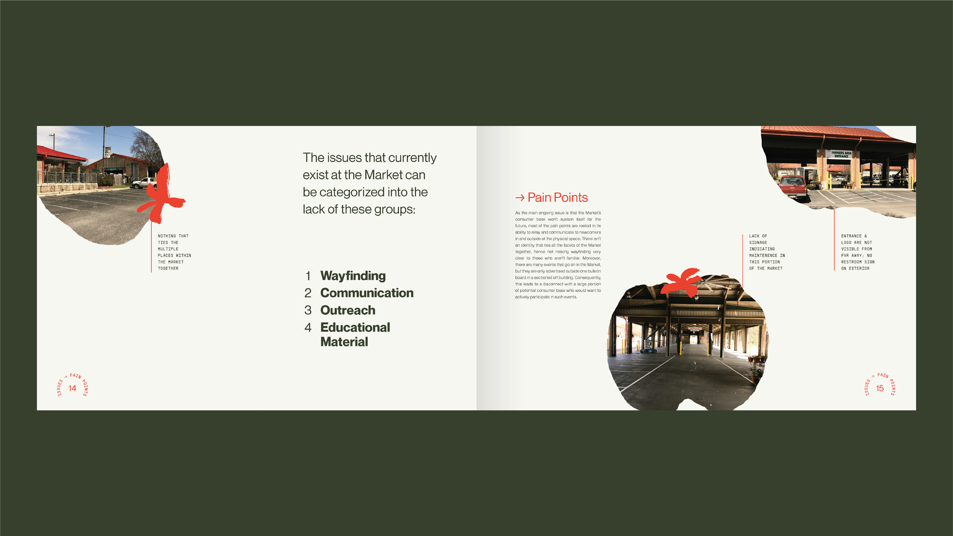
The State Farmers Market’s decreasing customer base is limited to faithful visitors who have been coming for years. I focused on implementing a revitalized identity across multiple touchpoints.IDENTITY
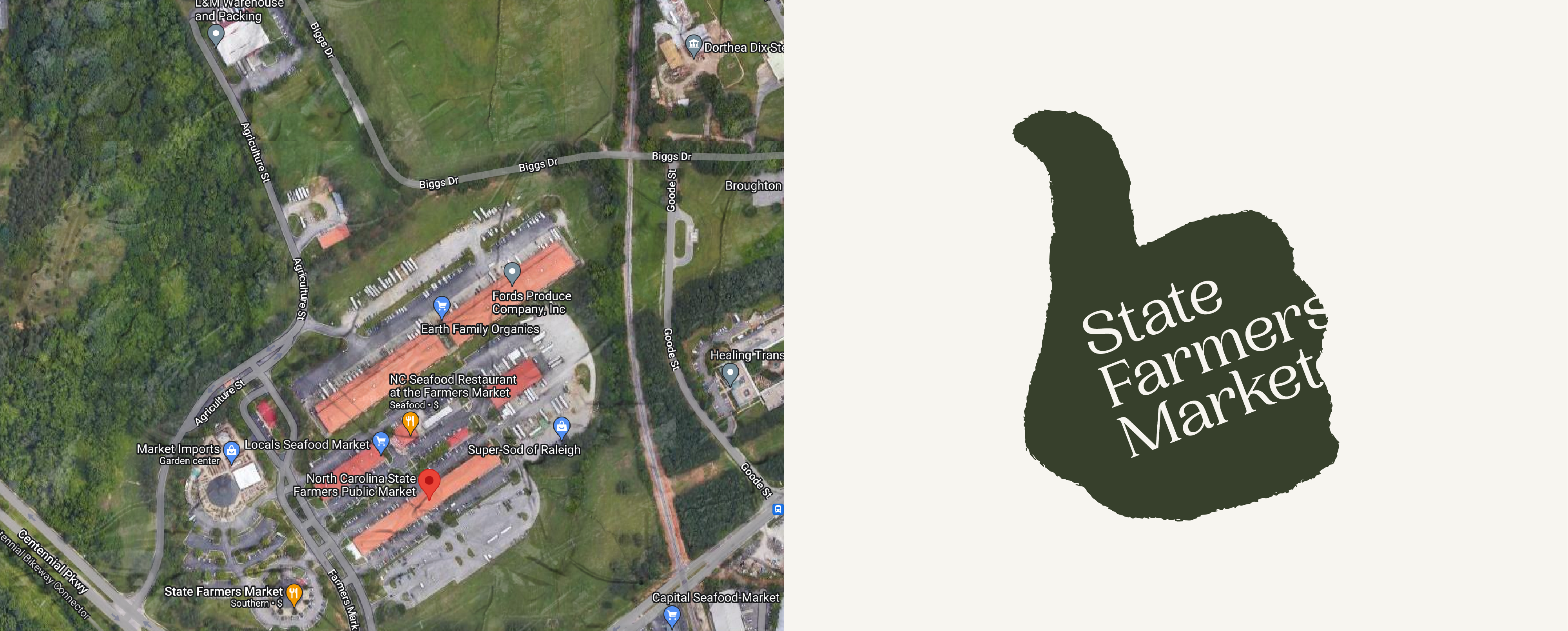
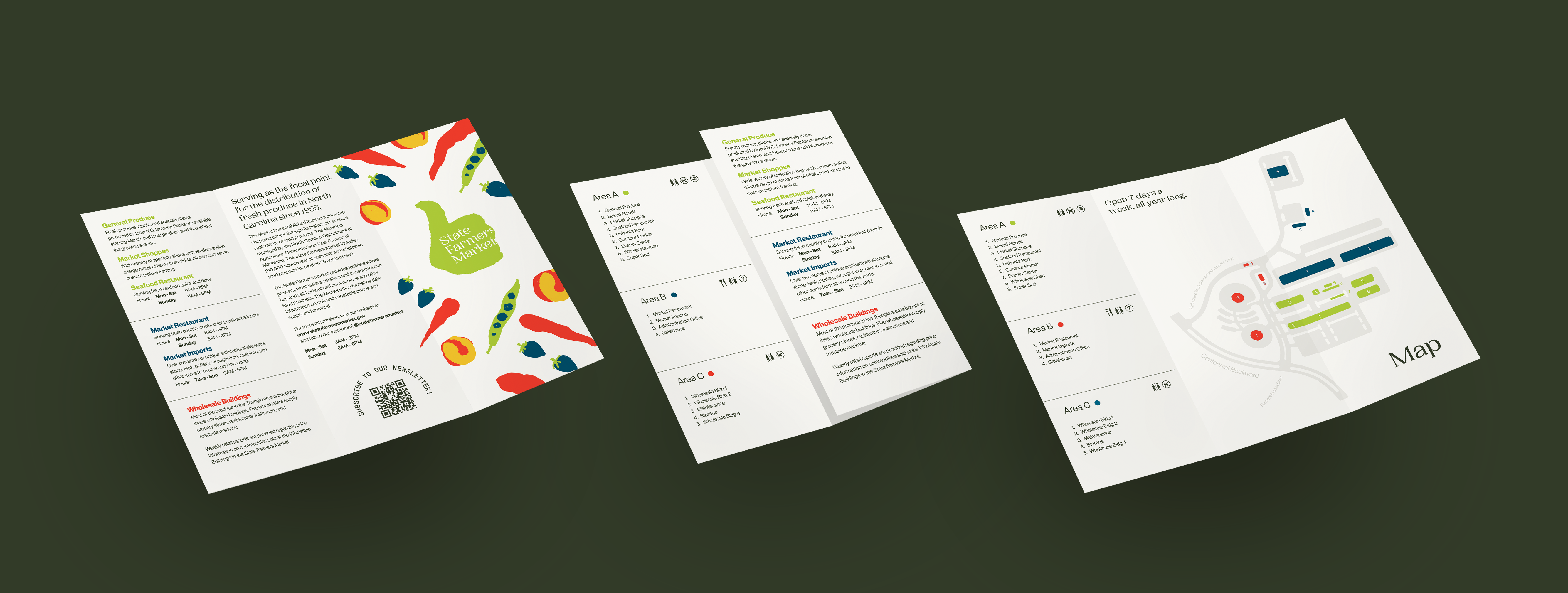
The brand incorporates hand-drawn illustrations of produce and a “green thumb” logo that mimics the shape of the market complex.


STRATEGY
Various touchpoints were designed to ensure that people of all backgrounds could access the Market.
We mapped each touchpoint out by its intended delivery and purpose to create access points for all target demographics.

The identity is reinforced through the market’s outreach materials.


UI/UX
The website positions the market as a community builder while giving visibility to all its offerings.

