Kiran: A Community Platform
A multimedia repository of Indian traditions and stories based on community submissions of personal archives and opinion pieces
Spring 2020 - Fall 2021
For my independent study, I wanted to showcase the (South Asian) Indian identity’s complexities with Indian-identifying audiences in mind. It was important to me that our own idea of “Indianness” was malleable and not constrained to a monolith constructed by imperialistic influences.Instructor
Rachael PaineAreas of Focus
Identity, Publication, UI/UX, StrategyIDENTITY
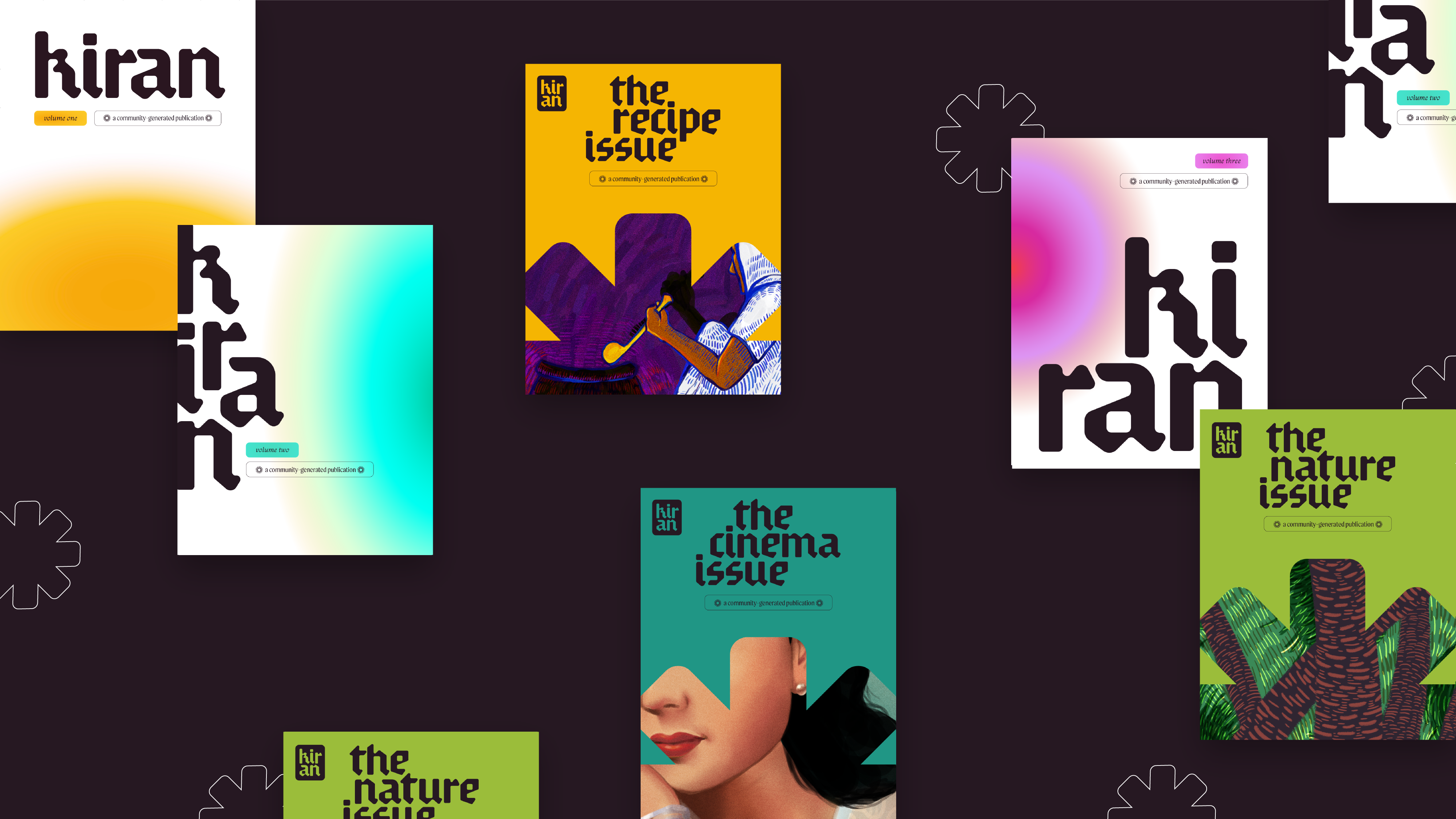
Modular typography combined with flexible color and layout treatments create a distinct identity for the project.


View the full publication ︎


STRATEGY
Kiran is presented as an inviting, open, and inspiring platform through its social media, an entry point for most users.

UI/UX
The website is a central hub that allows for visitors to be subscribers and contributors.
The intuitive pathways ensure that every visitor can understand Kiran’s purpose and scope of material. The subscribed users are able to access all the articles by using various filters.

Unlike its publication counterpart, the website’s UI makes use of a strict layout to prioritize easy readability. This layout is paired with Kiran’s vibrant branding for a seamless user experience. User interactions consist of horizontal scrolling through volumes, issues, and articles. The only time the website breaks its grid is for the article catalogue.
UI/UX
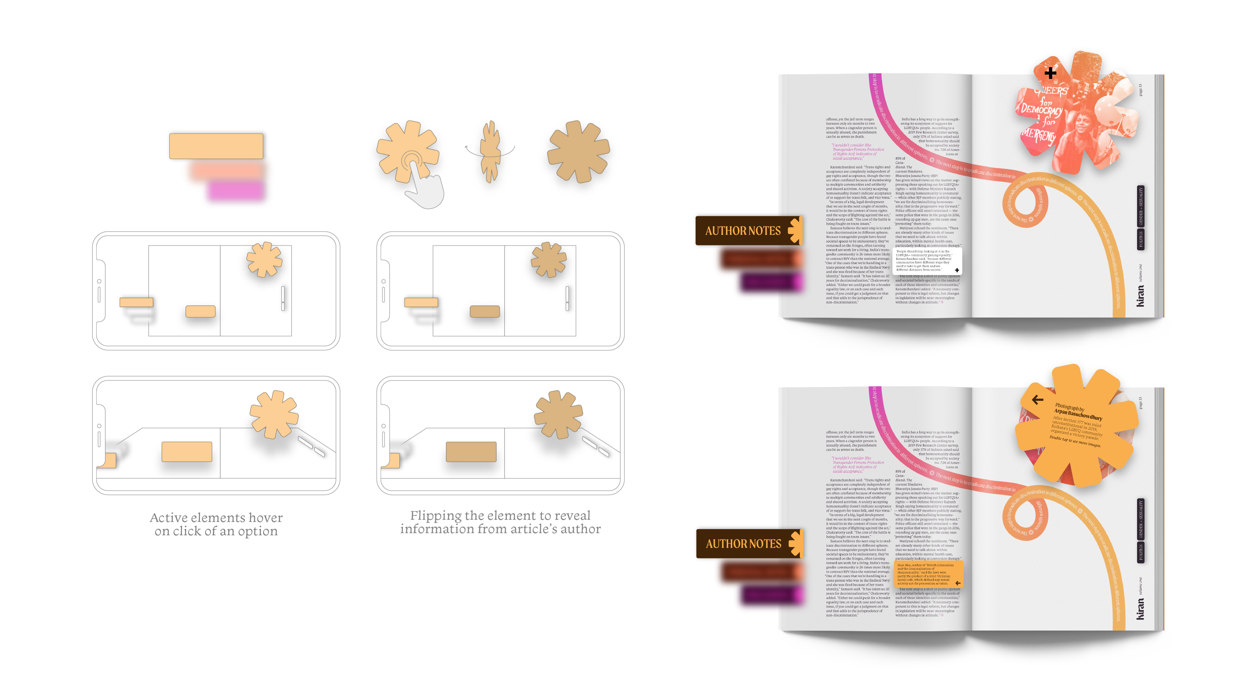
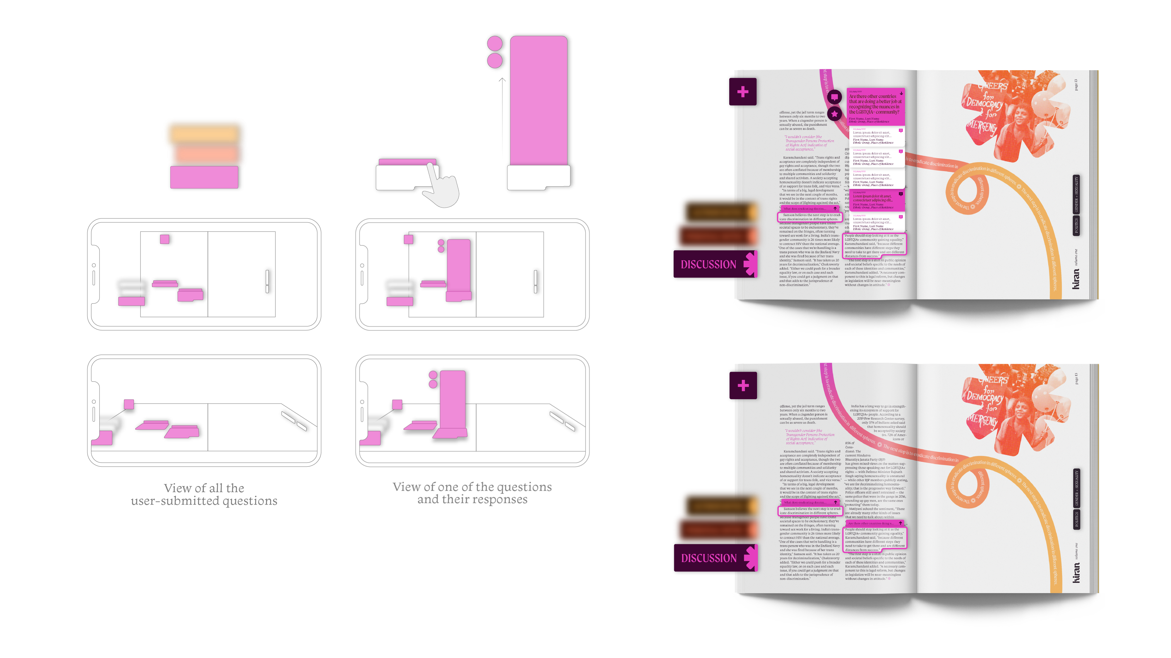
The publication’s augmented reality supplement enables community dialogue and visualizes layers of information and resources in a spatial manner.
The three levels of information include the article’s “Author Notes”, “Personal Notes” that the user would take that are private, and the community “Discussion” that consists of public question/answer format conversations that the user can participate in.


