DEEP: Skincare for the Melanated
A skincare and dermatologist directory catered towards dark-skinned consumers
Fall 2020
DEEP aims to change the way skincare is advertised in an oversaturated market by centering darker skin tones across multiple platforms.Instructor
Victoria ChiCollaborators
Molly Mills, Jillian TylerAreas of Focus
Identity, Strategy, UI/UXIDENTITY
The “bump” implemented in the logotype is inspired by textured skin, while the extensive color palette is bold, earthy, and gender-neutral.


STRATEGY
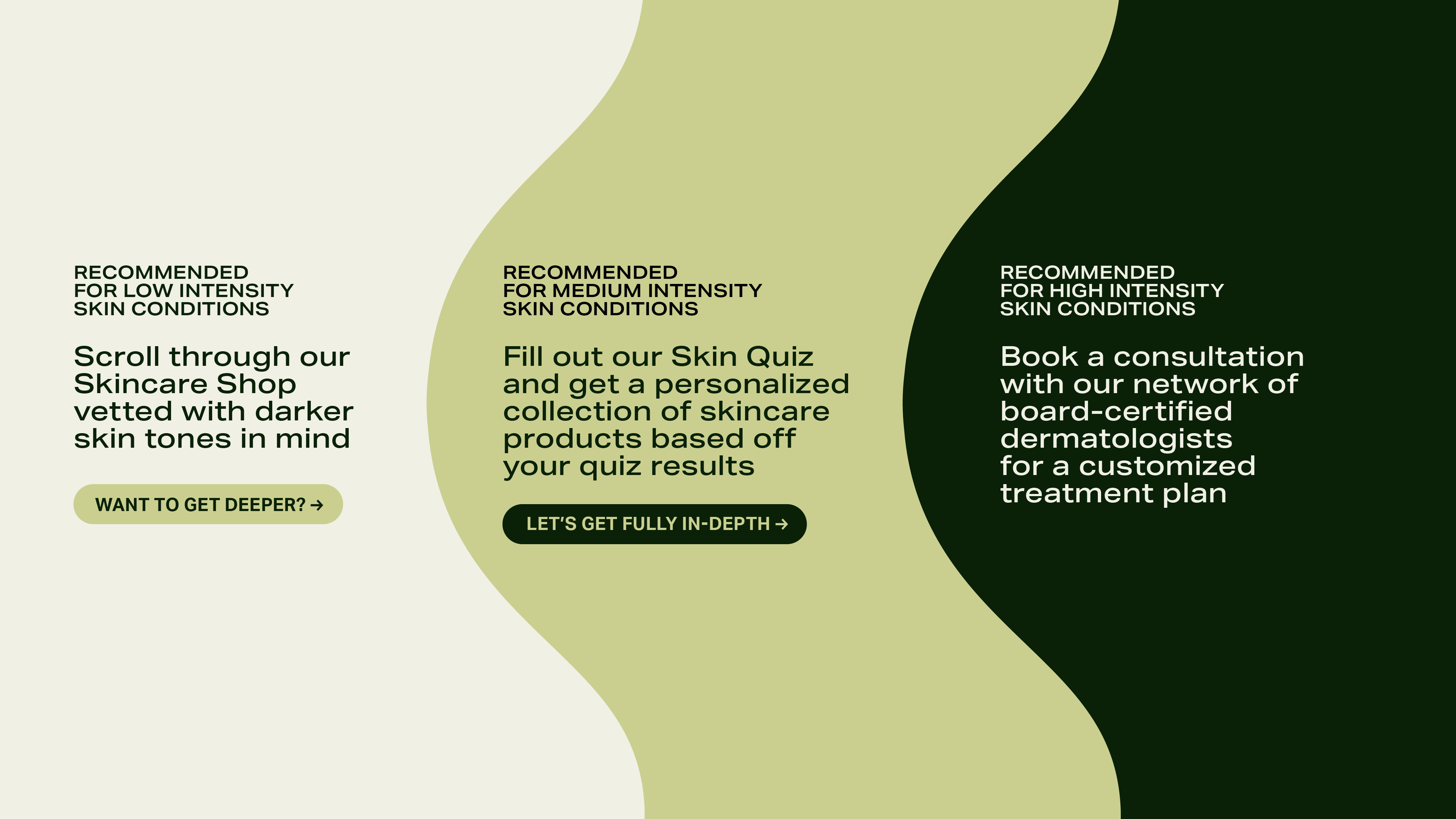
DEEP is a directory for products and dermatologists that specialize in darker skin tones.
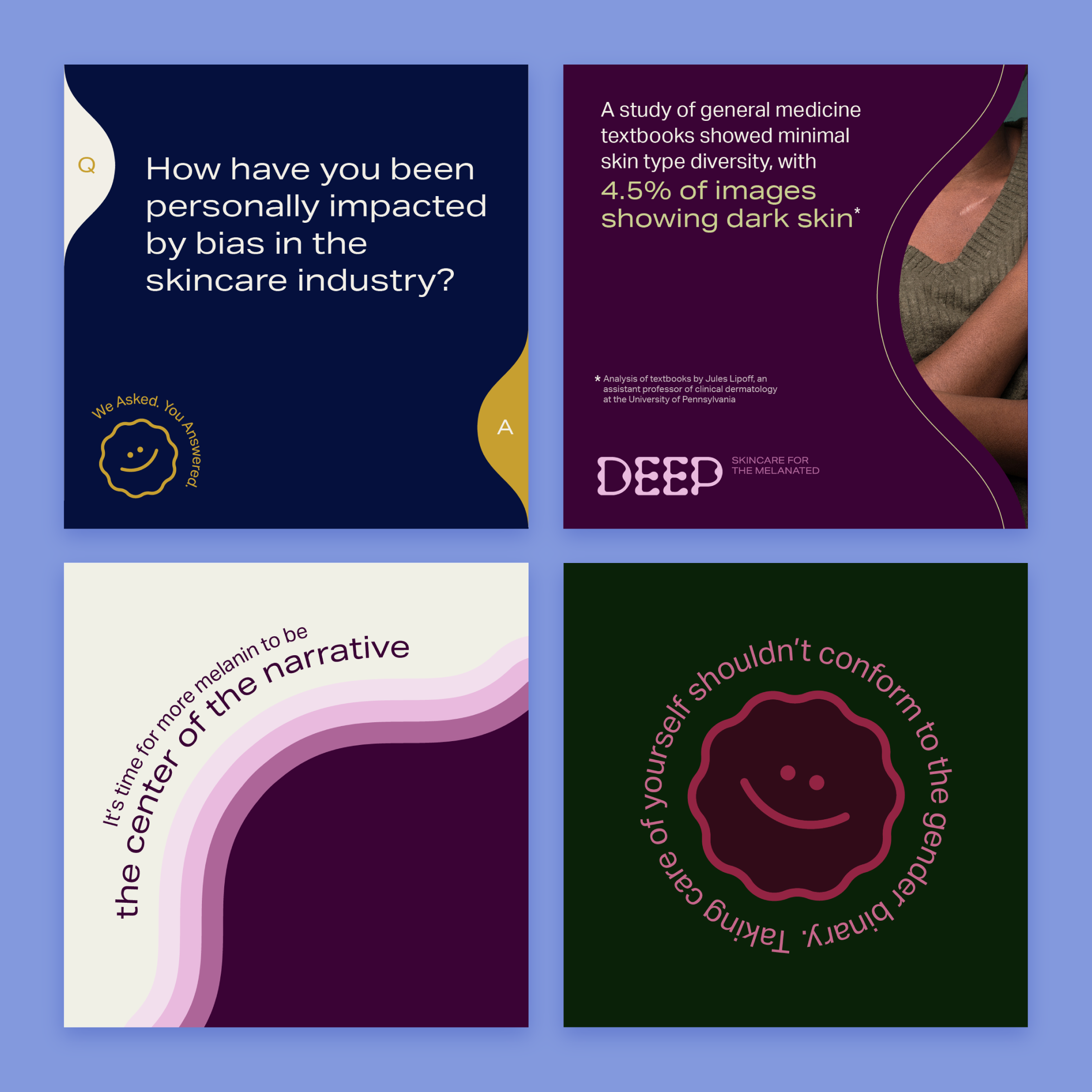
We conducted user research to consolidate common pain points within the skincare industry. The issues that we decided to focus on were lack of inclusion, education, and streamlined access. Various touchpoints were designed to center the varying needs of those with darker skin tones.


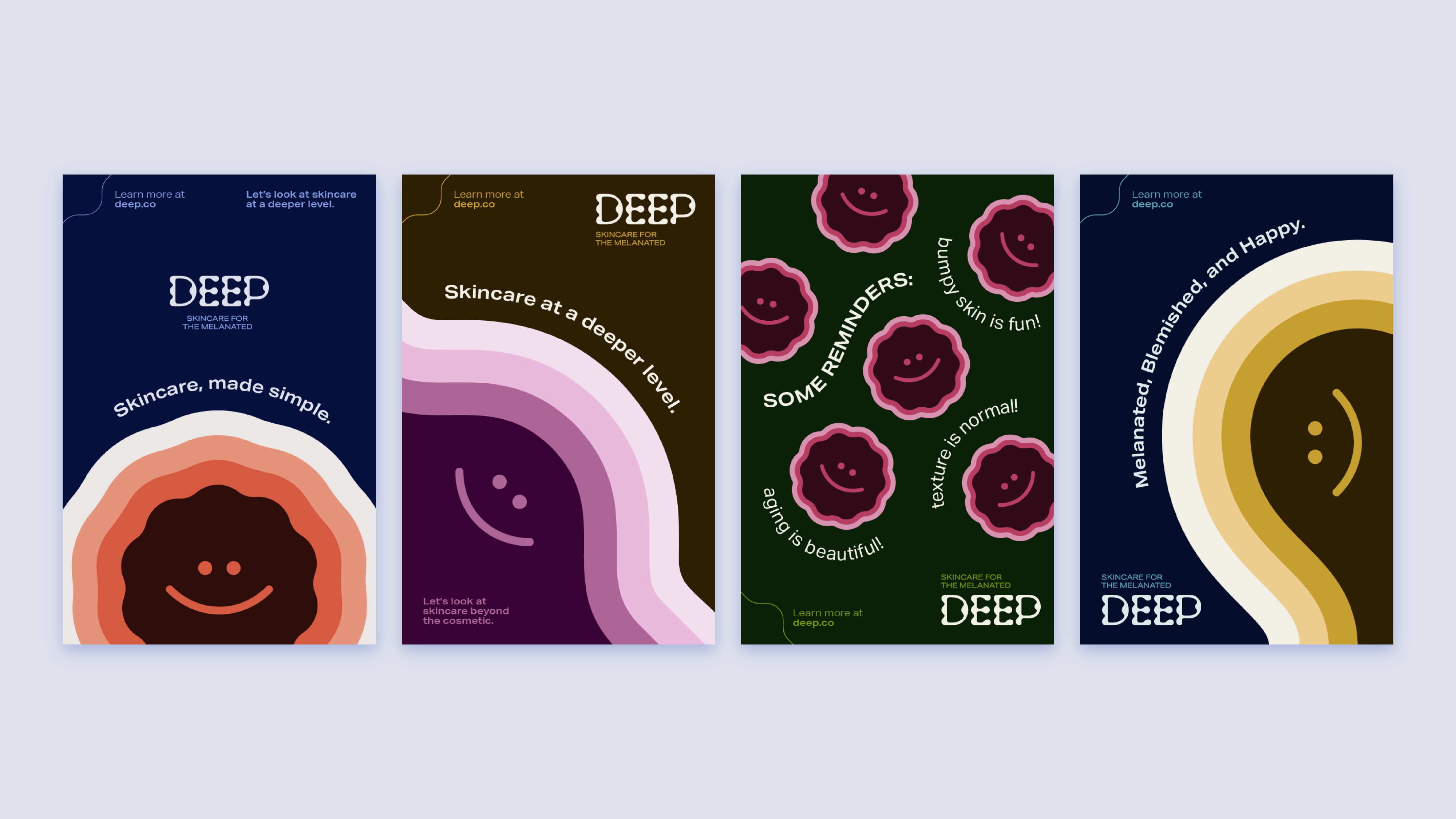
The promotional campaigns shift the focus away from cosmetic skincare.
Instead, DEEP’s messaging normalizes skin variances, while raising awareness on skin disorders that need treatment.


UI/UX
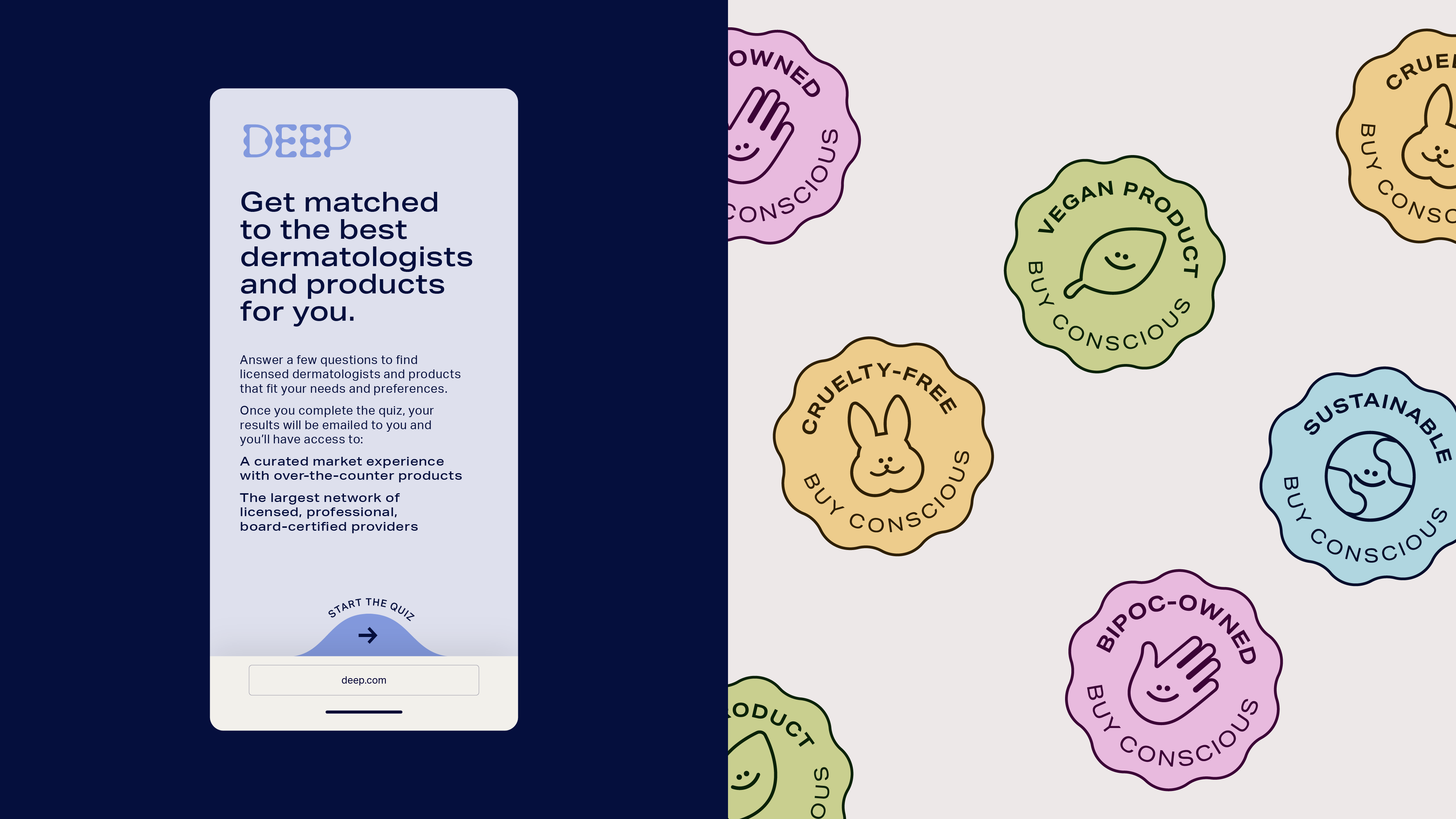
The DEEP website is the primary touchpoint users interact with to get curated treatments.
We created an information architecture that can house the multifaceted nature of the DEEP platform. Users that have taken the skin quiz will experience the site differently with a personalized market and access to the dermatologist repository.


